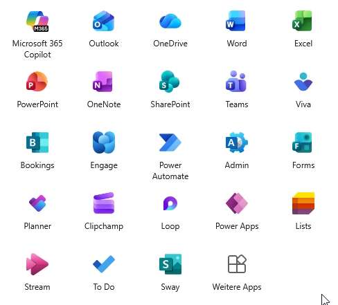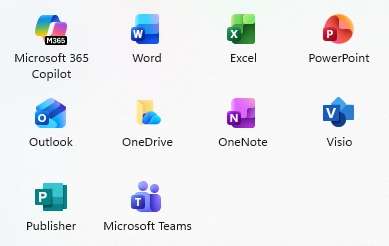
Microsoft rolled out a comprehensive icon redesign for the MS365 suite in October 2025.
Main applications from Word, Excel to Teams have received new icons, which represent a clear departure from the previous design.
What has changed?
The new design follows Microsoft’s “Fluid Design” philosophy and brings with it much more modern, colorful icons. The icons now rely on organic shapes with vibrant gradients instead of the previous flat designs. Particularly striking: All apps now get softer, curved shapes that are based on Copilot’s design language.
Why the change?
Microsoft justifies the redesign very clearly: It is intended to visualize AI integration. All icons are now based on Copilot’s design and are intended to show that Office apps are no longer just tools, but intelligent AI partners. The update also improves accessibility and display on different displays.
Implications for administrators
The icon update is carried out automatically via the regular Office updates without any necessary administrative measures. Current Channel users have been receiving the new icons since the beginning of October, with Monthly Enterprise Channel following at the end of October.
User communication
Proactively inform your end users about the visual changes. The functionality of all applications remains unchanged, only the icon display has been modernized. Timely communication through internal channels significantly reduces potential support requests.

The icon redesign marks Microsoft’s strategic transition to an AI-centric product identity. The new icons offer improved readability and modern aesthetics. There is minimal direct effort for administrators, but user communication and documentation maintenance should not be neglected. The fitting usually takes place within a few days without functional impairments.


Be the first to comment